Communications – 2025-01
Submitted by Kristine Houde
1. OOECA logo survey (Google Forms)
34 responses to date. Slight uptake following AGM, no change since posting link to OttawaEast.ca.
- Responses to Q1, “Select up to 3 key features of OOE from the list” represented in bar graph, with Rideau Island, Flora Footbridge, Rideau River, and Grande Allee at the top of the list.

- Responses when asked to provide a phrase or tagline that represents OOE:
- Main-ly between canal and river
- Ottawa’s hidden gem
- Vibrant living between the waters
- Friendly small community
- Your next adventure is along the street! OR The street to somewhere special
- Welcoming, vibrant, growing
- Vibrant and historical
- Building community hubs
- An Island community
- Hidden Gem
- Community in action. Community first. Together we thrive. Connect collaborate celebrate. A place for everyone. Rooted in community
- Engaged
- Diverse, beautiful and tolerant
- We are care and hope
- Strong, diverse community with generations of history and a village vibe
- happy homes and families between the canal and the Rideau river
- Historic neighbourhood
- Welcoming, beauty of the canal and river, variety of people of all ages
- “Vibrant and Caring Between the Rideaus” is my second suggestion.
- Old Ottawa East – a vibrant, and historic community in the heart of Canada’s capital city. Known by it’s Rideau River and the UNESCO Heritage Site, Rideau Canal location, Old Ottawa East blends residential charm and premium (prime/exceptional/superior) access to parks, waterways, trails, and the downtown core.
- The village in the city
- City Neighbourhood in nature
- Responses to call for feedback to guide logo design, OOECA branding or general comments:
- There are a few companies/stores in the list I think the logo should stay away from prominent display of these. It looks like promotion. The logo should be not be tied to a business.
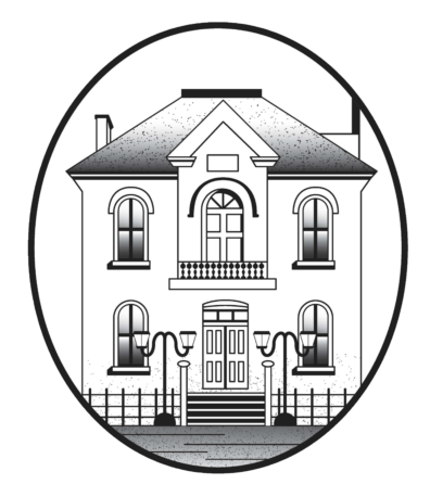
- Keeping the Old Town Hall part of the new logo would help with the goal of differentiating OOE from other nearby neighbourhoods, as it is one of the most recognizable landmarks in the neighbourhood. It also speaks to the neighbourhood’s distinct heritage. Perhaps it could be edited to add an image of the canal or trees to represent the abundance of green space in the neighbourhood. Many of the other suggested features are either shared with other neighbourhoods (Rideau Canal, Flora Footbridge) or would be oddly placed in a community logo because they are private entities (Saint Paul University, Green Door Restaurant).
- Trees, pathways, buildings, meet-ups, biking
- It is our unique features that may define us from others. We’re lucky to have the geography that defines us – the island more access and amenities by the water is what will make us more unique to define us!
- It would be nice to see natural elements.
- Rideau island and snapping turtle = Turtle Island. As in one of the Anishinaabe creation stories. The Rideau river was a major trade route for the Anishinaabe. OOE is situated on unceded Anishinaabe land. In light of all the many Oblate named streets in our neighbourhood now, I think we owe something to the keepers of the land.
- Green color to show that as a community we value the environment and try to make the most of it to make green, sustainable and innovative decisions to grow our community
- The image is important but the words will be most impactful.
- I like the old town hall image but it could be updated to a more modern drawing style. Including water/river would be a nice addition.
2. OOECA website
- Website updates include new format for committees landing page, individual committee pages for all committees, and Archive page now renamed to Meeting Minutes.
- Further updates, including monthly reports and resources posted directly on committee pages, will be added over the coming months.
- Board agendas and minutes now posted directly to our website to promote digital-first approach to communications, and greater accessibility for users with disabilities.
